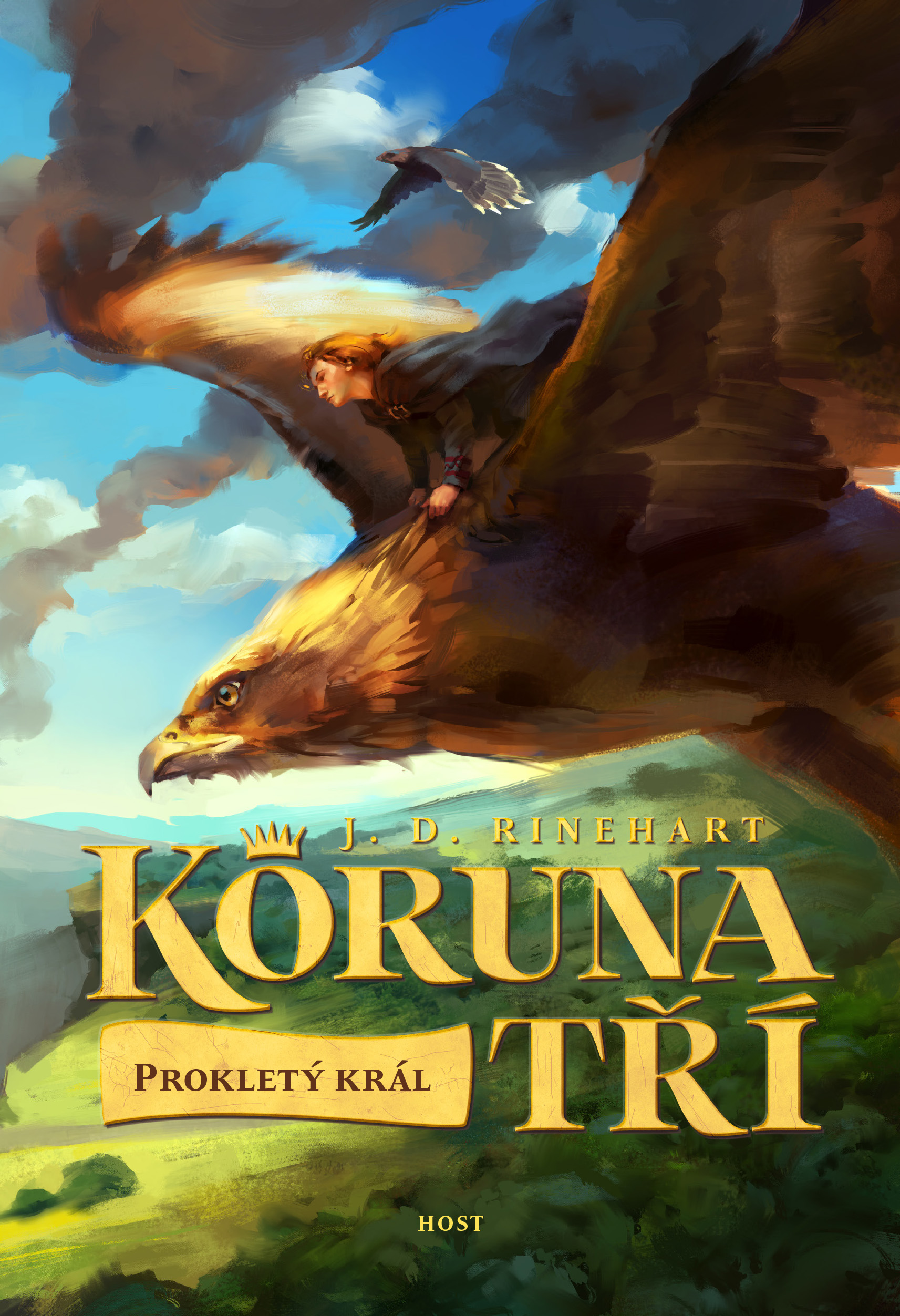
I always enjoy seeing how cover art differs around the world. Here’s the beautiful artwork for the Czech edition of my new novel for young readers, Crown of Three. Click here to compare it to the US edition.
Graham Edwards – Author & Journalist
Fantasy, sci-fi & crime fiction, plus behind-the-scenes articles on movies & TV shows
I always enjoy seeing how cover art differs around the world. Here’s the beautiful artwork for the Czech edition of my new novel for young readers, Crown of Three. Click here to compare it to the US edition.

Both covers are appealing, but I say it’s Czech-mate for the Czechs — nice composition, good use of color, classic painting style. But then, I’m an adult. The U.S. edition speaks more to its younger target audience, with a more stylized “kids’ book” illustration, younger-looking subjects, and a Harry Potter-ish vibe. So which is more successful?
I agree, Don. The US edition is terrifically punchy, but the Czech edition has a beautifully classical look. National identity reflected in promotional design?