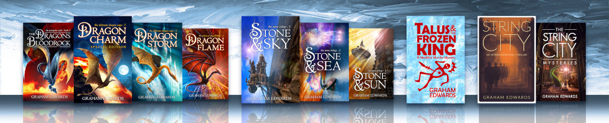

When I turned my attention to the cover design for my self-published novel The Dragons of Bloodrock, I had a pretty clear idea of what I wanted: a giant grey dragon speeding over a desert, with a huge wall of red rock looming in the background.
I roughed out a few pencil compositions before settling on one featuring a dragon with improbably large wings. I based the posture on some photographic reference of bats captured in mid-wing-beat by high-speed cameras. Boy, do those little critters strike some extraordinary poses. From a scan of the chosen rough, I blocked out the cover in Adobe Photoshop.

The first layout was okay, but not nearly dramatic enough. The dragon was too small, too neatly centred. I pulled him forward, cropping the edges of his wings a little and narrowing his proportions. From there, I created a master pencil drawing of the dragon. While doing this I refined the pose, adjusting the skeletal structure so that it made at least some kind of sense.

I scanned the drawing and traced the linework in Adobe Illustrator, creating a collection of shapes – head, body, wing membranes, wing bones and so on – which I then imported into a master Photoshop document. Isolating each shape on a separate layer, with additional layers for the various environmental features, I fleshed out the image by combining hand-painted elements with photographic textures.
As the image came together, I started experimenting with the colour palette. I’d started out thinking I wanted quite a pale image overall, with the grey dragon silhouetted against a brilliant sky. No matter how I rendered this, however, it didn’t work. The background looked washed-out and the grey dragon just looked dead. I steadily gravitated towards a cover much darker than I’d originally intended, and introduced blue into the dragon’s scales to help bring him to life.
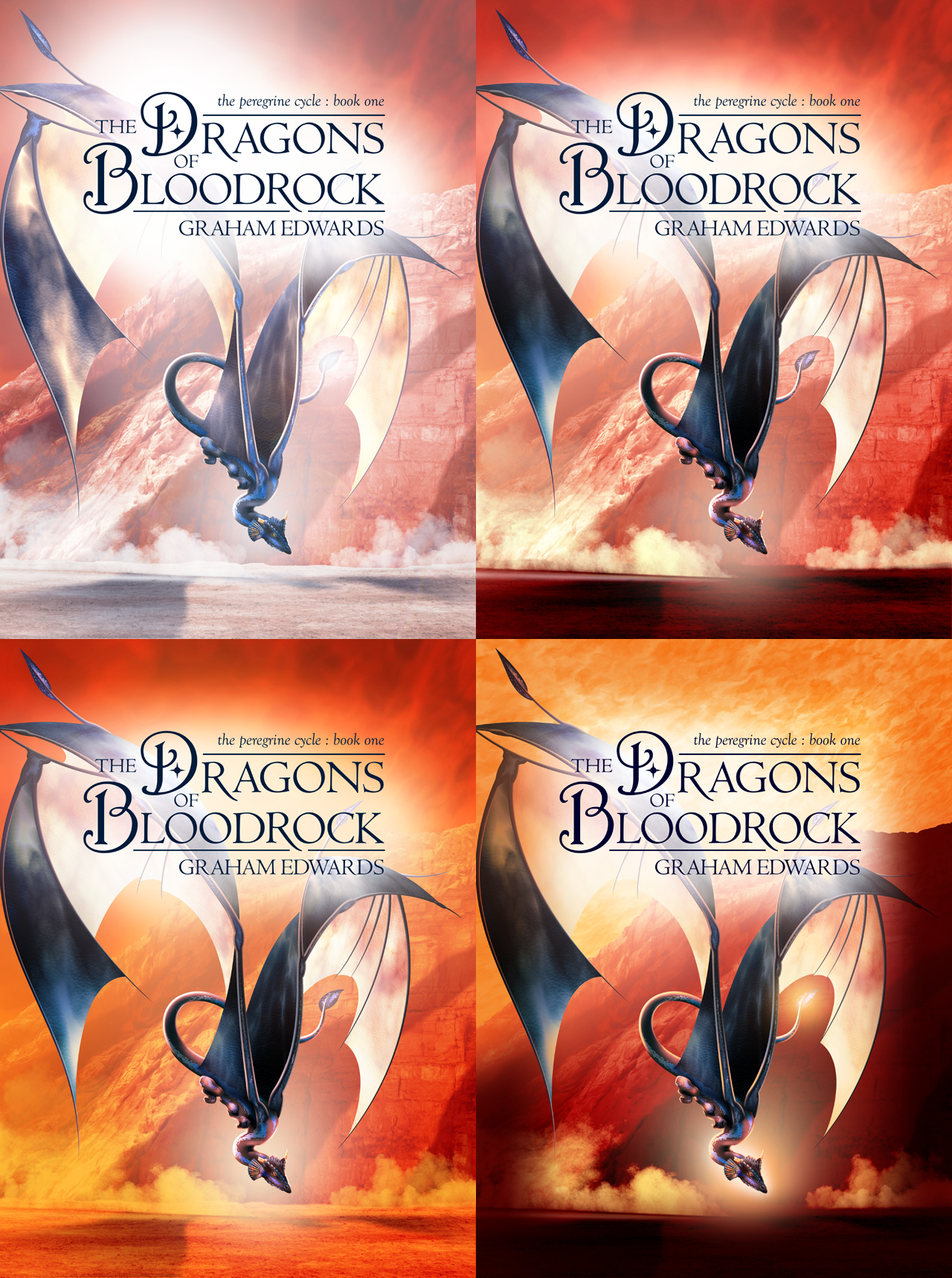
Like most creative journeys, this one took me on a roundabout route to a solution that, now I look at it, seems obvious. Why did I mess around with all those blown-out backgrounds when the book is called “The Dragons of Bloodrock?” The clue, as always, is in the title. If I’m putting rock in this picture, it needs to be the colour of blood, right? And who needs sky, anyway?
Here’s a short video showing the progressive build-up of the final cover design:

I didn’t realise you had painted the front cover yourself, Graham! I was looking on the first pages inside the book to try and find the name of the artist, but I couldn’t see anything. You are certainly a man of many talents!
Also, I couldn’t help but think of this meme format:
“Wait, it’s all Graham Edwards?”
“Always has been”
Thanks, Andrew, nice to hear from you. Love the meme idea! I did the covers for both of the recent self-published dragon books – “Bloodrock” and the re-issued “Dragoncharm.” Going back in time, I drew all the interior black-and-white illustrations and chapter heads for the original paperback “Dragon” and “Stone” trilogies, but those covers were the work of Geoff Taylor and Les Edwards respectively.